Body Copy
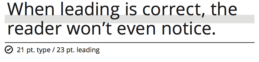
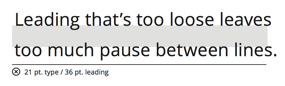
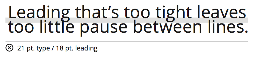
Line spacing, called leading, is critical to setting professional-looking type that’s easy to read. Leading should be set tight, but not too tight. With our typefaces, text generally looks best with leading set slightly looser than the default.
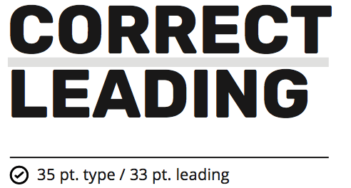
This leading is correct.
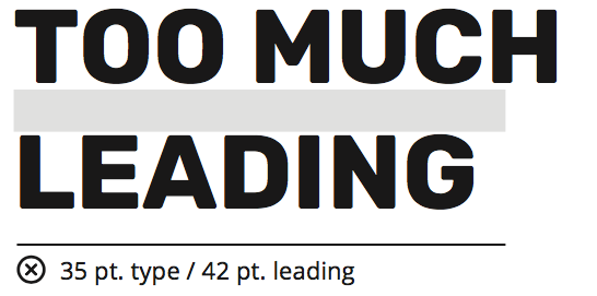
This leading is too loose.
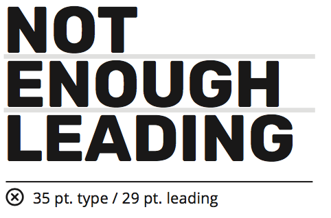
This leading is too tight.
Headlines
While the same general leading rules for body copy apply to headlines, leading for headlines will usually be a little tighter. This is because we typically our headlines are typically shorter and in a bold, block typeface or in all caps. Headlines set at smaller sizes may need more leading than headlines set at larger sizes. We want to be sure our that headlines can be read quickly and easily, and leading that’s too tight at small point sizes makes this difficult. Trust your eye, not the number. If it looks too tight, it probably is.