
When it’s used thoughtfully, typography becomes a powerful brand tool that can add visual meaning to what we say. Pitt’s typography communicates clearly and cleanly, with enough flexibility for a wide range of situations.
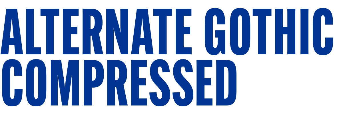
Alternate Gothic Compressed is our hero typeface. Used in all caps, it can powerfully capture the culture of our campuses visually. With a variety of weights, it is a flexible typeface that can be used at different scales, always ensuring readability.
Alternate Gothic Compressed is available from Adobe Fonts for those with access to the Adobe Creative Suite. For users who don’t have access to Adobe Fonts, licenses can be purchased at myfonts.com.

Instrument Serif pairs with Alternate Gothic Compressed to introduce the spirit of possibility to the type system. This serif typeface emulates the architecture of the Cathedral of Learning and provides a sophisticated type option if needed. Instrument Serif is not suitable for large amounts of copy. Do not use it for body copy.
Instrument Serif is available through Adobe Fonts and Google Fonts.
Support Typefaces
Our support typefaces complement our primary typeface by adding variety and flexibility to our designs. They are used for secondary text and specific applications to ensure a cohesive and harmonious visual identity.
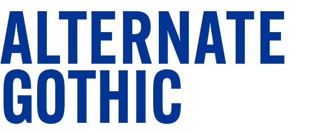
Alternate Gothic is used for subheads and supporting copy due to its clear and bold appearance. It enhances readability and keeps our visuals consistent. It is available via Adobe Fonts.
Download Alternate Gothic font

Merriweather is a legible serif typeface that should be used for body copy and supporting copy. It is available via Adobe Fonts and Google Fonts.
Download Merriweather font

Roboto is a practical sans-serif typeface that should be used for body copy and supporting copy. The clear letterforms and variety of weights ensure legibility at a variety of sizes.
Download Roboto font