University Header
The official Pitt logo must appear at the top of each page in the header element. The header may not be edited, resized, or include additional elements. It must include the correct margins and spacing. No other marks may appear above, adjacent to, or on the same horizontal plane as the University shield and signature. You may download the starter HTML/CSS template or contact us to request files containing HTML and CSS for site headers and footers. Attributes of the header include:
- Official Web version of University shield and signature justified left. The display width for the shield and signature is 135px by 42px.
Institutional Mark
The University of Pittsburgh’s Institutional Mark is composed of the shield and signature. It embodies the heritage and prestige of our institution. This logo serves as the cornerstone of our visual identity, representing our commitment to excellence and our proud history. Consistent and correct usage of the Institutional Mark is essential in maintaining the integrity and recognition of the Pitt brand.
Clear Space & Size
We ensure that other elements don’t compete with the Institutional Mark by maintaining a minimum amount of space around the perimeter, measured with the height of the P in Pittsburgh. This applies to all versions of the mark except in cases of subbranding with schools, centers, institutes and departments.
Site Title/Logos
The title of the site must appear in the font Roboto. Unique unit logos are not permitted in the header space without permission from University Communications. Contact us if you feel you need a unique mark for your site. The site title may include two lines of text in order to accommodate a stacked title or the name of a parent unit. The unit name must be rendered HTML-based Roboto Medium font at 24px in height on one line or 17px over 24px Roboto Light if two lines.
Example blue header with one-line title and navigation:
ADD SCREENSHOT
Example blue header with two-line title and navigation:
ADD SCREENSHOT
Please submit a request for header files.
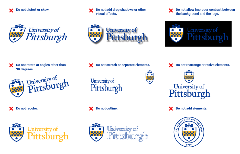
Incorrect Usage
To ensure consistent use of the logo, here are some practices to avoid:
- Don't skew or bend the logo in any way.
- Don't use drop shadows or other visual effects.
- Don't use the logo on a background with insufficient contrast.
- Don't use any colors other than those specified on this site.
- Don't outline the logo.
- Don't add elements to the logo.