
Our brand guidelines offer different logo lockups for flexibility and consistency, including horizontal, stacked, and vertical formats and shorthand. The horizontal lockup is our primary lockup and works best for wide spaces, while the stacked lockup is ideal for tighter or square areas. Each lockup should be used thoughtfully, ensuring proper proportions and spacing to maintain brand integrity.
Lockups should only be created by the Office of University Communications and Marketing.
Unit Lockup Formats
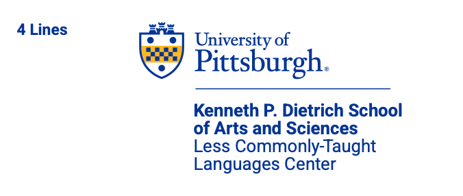
The horizontal unit lockup is the primary unit lockup and should be used in most instances, combining the University’s primary logo with aligned department, school, or unit names. It is ideal for situations where the available space is wider than it is tall.
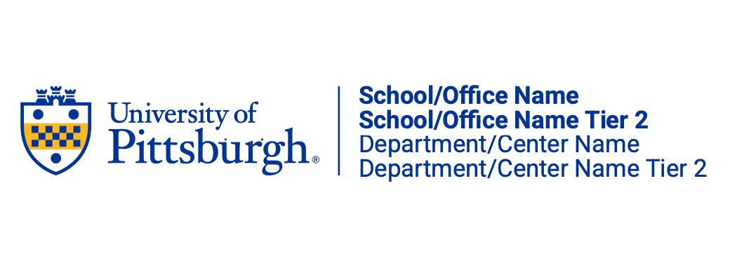
School Names on Top: Always place the school name above any other unit identifiers to emphasize the university’s academic hierarchy and primary association.
Departments and Centers Below: Position department or center names beneath the school name to maintain clear differentiation and visual balance. Consistent
Typography: Use the same font family throughout, adjusting size and weight to establish hierarchy. Apply bold weight for Schools and Offices and regular weight for Departments and Centers.
Alignment and Spacing: Ensure proper spacing between elements to maintain readability and a polished appearance within the lockup.
Examples


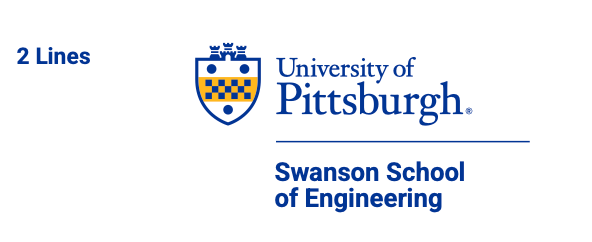
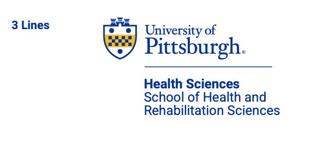
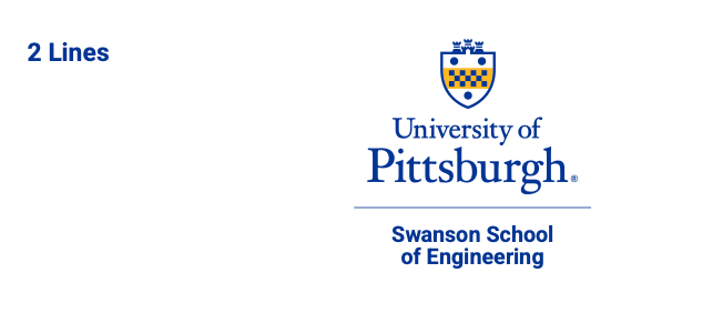
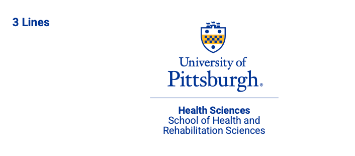
The stacked unit lockup is an alternative to the horizontal format and should be used when the horizontal lockup is not suitable, such as in spaces with limited width. This layout arranges the university’s primary logo above the aligned department, school, or unit names, making it ideal for vertical or confined spaces. It ensures clarity and legibility when the available area requires a more compact design.
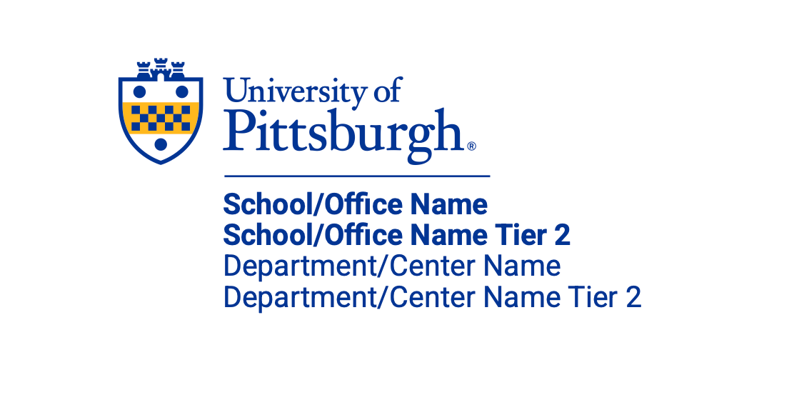
School Names on Top: Always place the school name above any other unit identifiers to emphasize the university’s academic hierarchy and primary association.
Departments and Centers Below: Position department or center names beneath the school name to maintain clear differentiation and visual balance. Consistent
Typography: Use the same font family throughout, adjusting size and weight to establish hierarchy. Apply bold weight for Schools and Offices and regular weight for Departments and Centers.
Alignment and Spacing: Ensure proper spacing between elements to maintain readability and a polished appearance within the lockup.
Examples

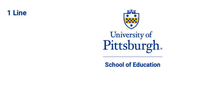
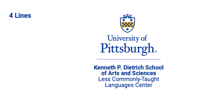
The vertical unit lockup combines the university’s logo with the unit name in a stacked, centered format. The logo sits above the unit name, creating a clean and balanced look. This layout is ideal for spaces where a more compact design is needed.

School Names on Top: Always place the school name above any other unit identifiers to emphasize the university’s academic hierarchy and primary association.
Departments and Centers Below: Position department or center names beneath the school name to maintain clear differentiation and visual balance. Consistent
Typography: Use the same font family throughout, adjusting size and weight to establish hierarchy. Apply bold weight for Schools and Offices and regular weight for Departments and Centers.
Alignment and Spacing: Ensure proper spacing between elements to maintain readability and a polished appearance within the lockup.
Examples
A shorthand logo should be used when space is limited, for informal or internal purposes.