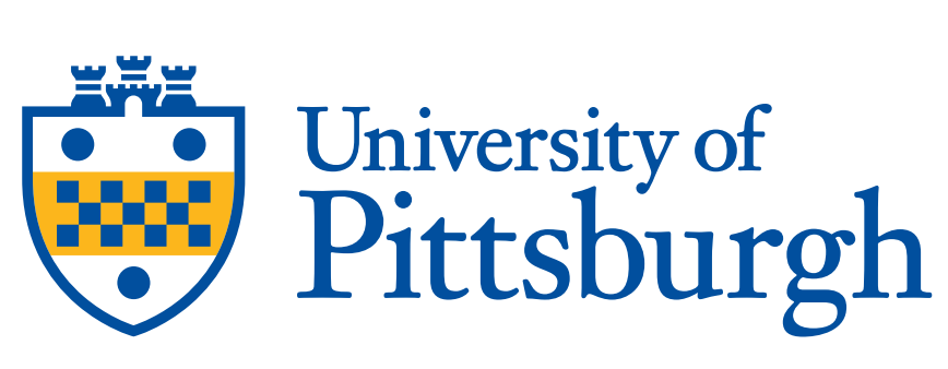
Our primary logo pairs the refined shield from our university seal with a sophisticated serif to pay respect to our heritage, in a simplfied, modern way. Whenever possible, use this full-color version of the logo.
Colors
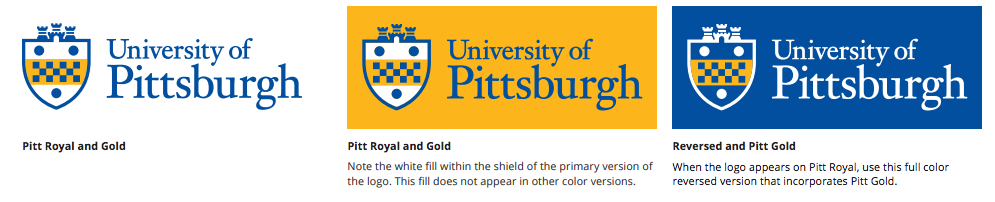
It’s important to have a versatile logo system that can accommodate a range of applications. To account for this, a number of color options have been created. These are the only approved versions of the logo.
Full Color
Whenever possible, default to the full-color versions. Pantone, CMYK and RGB versions exist, so use the one that’s most appropriate for the application.
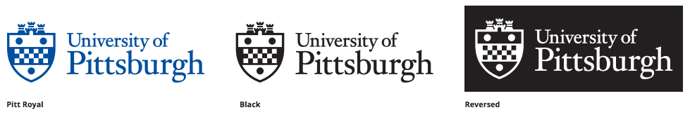
One Color
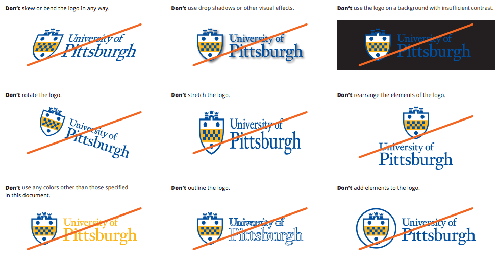
Incorrect Usage
To ensure consistent use of the logo, here are some practices to avoid.
Spacing and Sizing
It’s important that the logo always be prominent and legible, so keep these considerations in mind when using it in layouts.
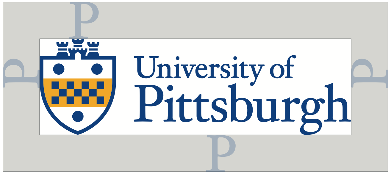
Clear Space
We ensure that other elements don’t compete with the logo by allowing a minimum amount of space around the perimeter, measured with the height of the “P” in Pittsburgh. This applies to all versions of the logo.
It’s important that the logo always be prominent and legible, so keep these considerations in mind when using it in layouts.
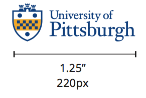
Minimum Size
Refer to these minimum sizes when creating designs to ensure that the logo’s details don’t get lost.