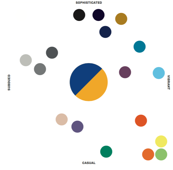
This diagram is a guide for the overall mood or tone of our communications. The components of our palettes can range from sophisticated to casual and from subdued to vibrant. Use this chart as a starting point to choose a set of colors that projects the right mood for your piece.

Color Balance
To strike the right balance of color for a desired effect, use these spectrums as a guide. This is not a precise mathematical system, but this chart provides an idea of relative use. Color groupings can range from formal to casual and from subtle to bold, depending on the purpose and audience of the piece. The diagrams below illustrate how we might distribute colors proportionally to generate the desired mood. Of course, this doesn’t mean that we need to use every color in our palette.
Bold

Typical Audience or Usage
- Prospective students
- Events
- One-offs and impact pieces
Casual

Typical Audience or Usage
- Accepted and current students
- Newer and younger alumni Industry
- Sustainability
Formal

Typical Audience or Usage
- Current faculty and staff
- Parents of current students
- UPMC collaborations
Subtle

Typical Audience or Usage
- Older alumni
- Most conservative and hallmark pieces
